01
AQUILA PRO AI
Advanced router settings, redesigned so a parent will actually tap them and an engineer still finds what they need.
The 30-second version
- The problem
- Mesh Wi-Fi is sold to ordinary households, but only people who understand networking could set it up. When setup fails, the box goes back or support gets a call.
- What we did
- We had ten colleagues with no networking background set it up alone from the box, and found five sticking points. The three inside the app were redesigned. I also moved the three most-used tasks from three levels deep to one.
- Result
- Shipped and still on sale. Related operation errors down by an estimated 70% (from support tickets, not a controlled test). Colours pass WCAG AA.
My part
- Framing the research questions
- User research & usability testing
- Design strategy from research
- Interface design & prototyping
- Design system handoff
Platforms
- iOS
- Android
Team
- 1 UX designer
- 2 UI designers (incl. me)
- iOS engineer
- Android engineer
- Product owner
Client & timeline
- D-Link
- 2023 – 2025.10
Background
A Wi-Fi app built from zero
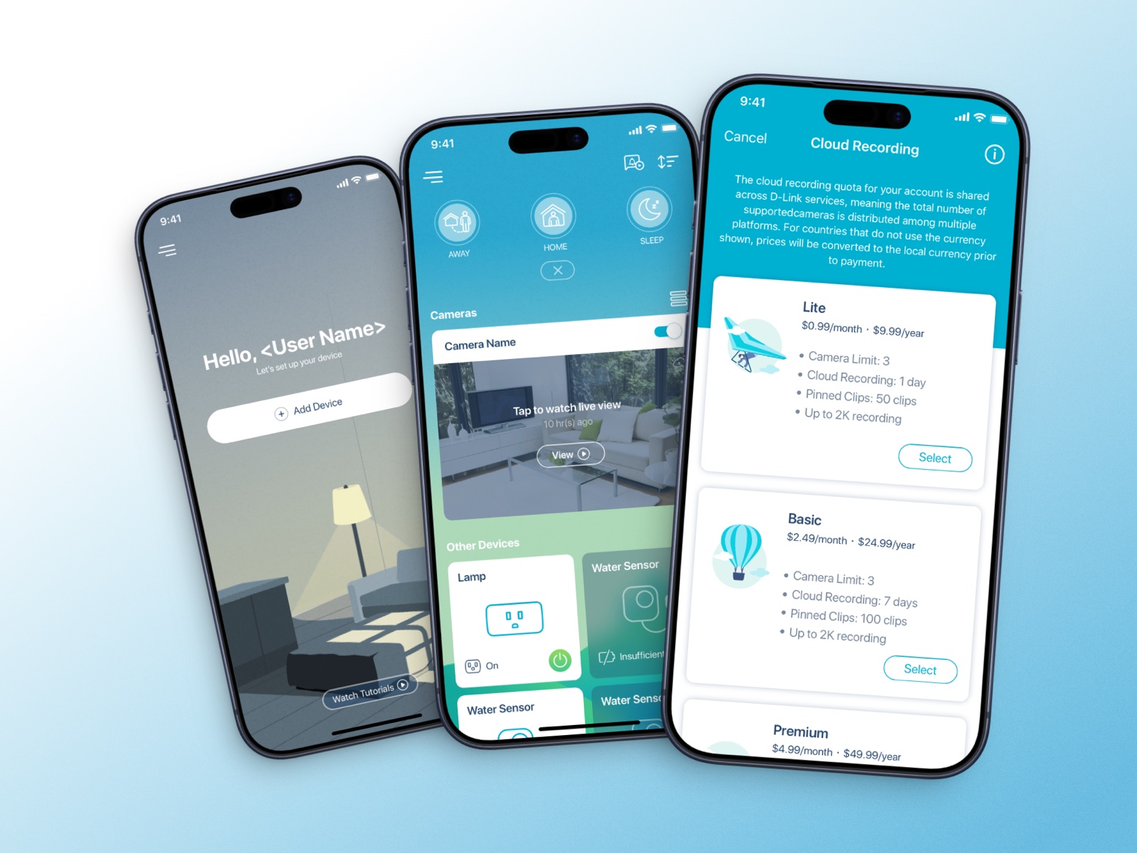
AQUILA PRO AI is D-Link's mesh Wi-Fi system. The app had no previous version to build on.
Three constraints came with it: a tight launch date, support for older hardware, and colours that had to match marketing. The goal was simple: someone who knows nothing about networking should still be able to set it up. A failed setup means a returned box or a support call, so we put most of the effort into setup.
Competitors
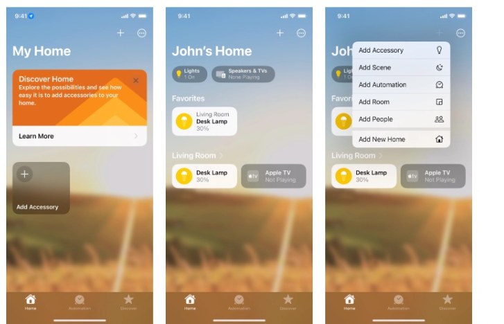
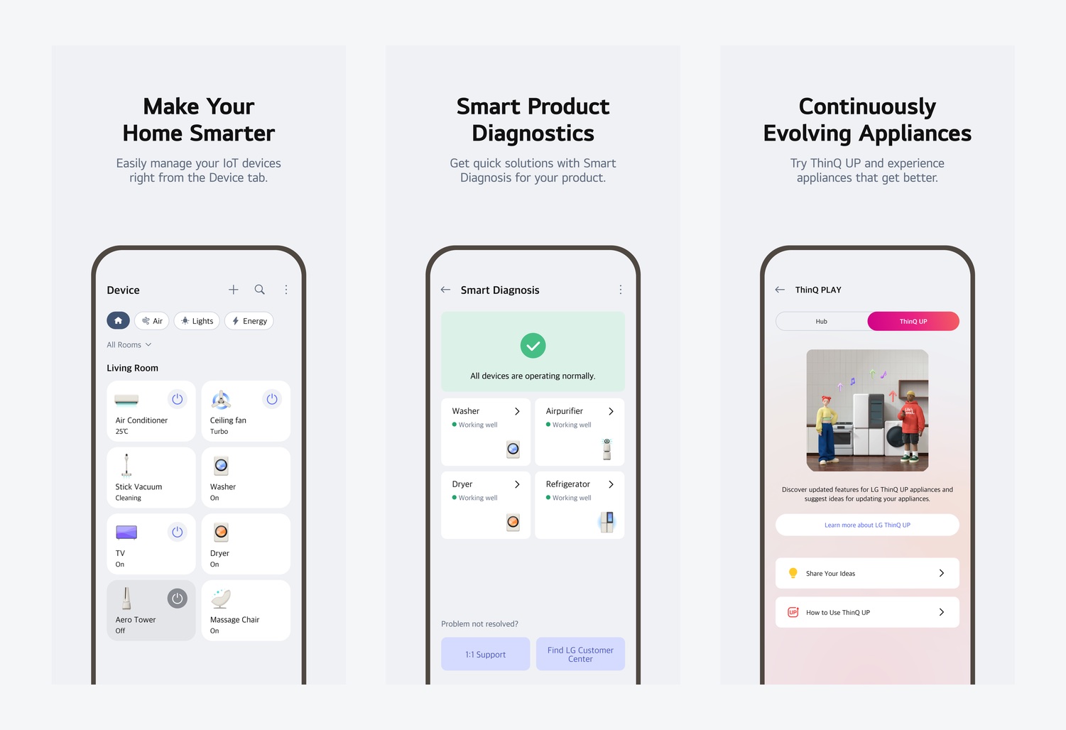
What we took from HomeKit and LG ThinQ
HomeKit hides the technical detail: people only see rooms and devices. We kept that, but a router can't hide everything, because the network itself is what we sell.
LG ThinQ checks its own hardware. That fits a router well: when something breaks, the first question is whether the device is the problem.
Research
Testing with the people most likely to fail
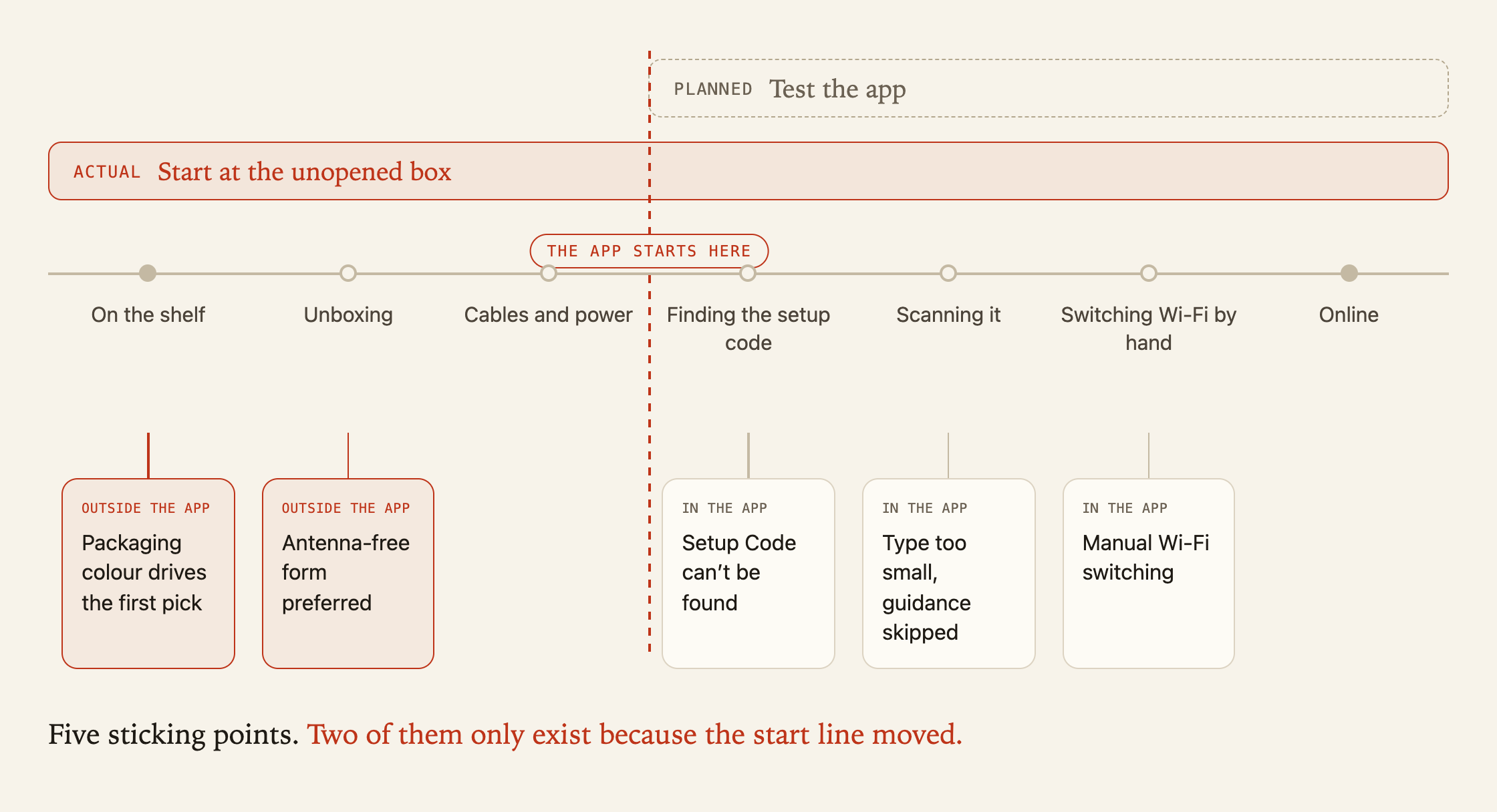
We asked ten colleagues with no networking background to set up the previous model, the Eagle Pro AI M32, on their own. We watched from unboxing all the way to getting online, not just the app.
- 10
- people tested
- 5
- sticking points
- 2
- outside the app
Proposals
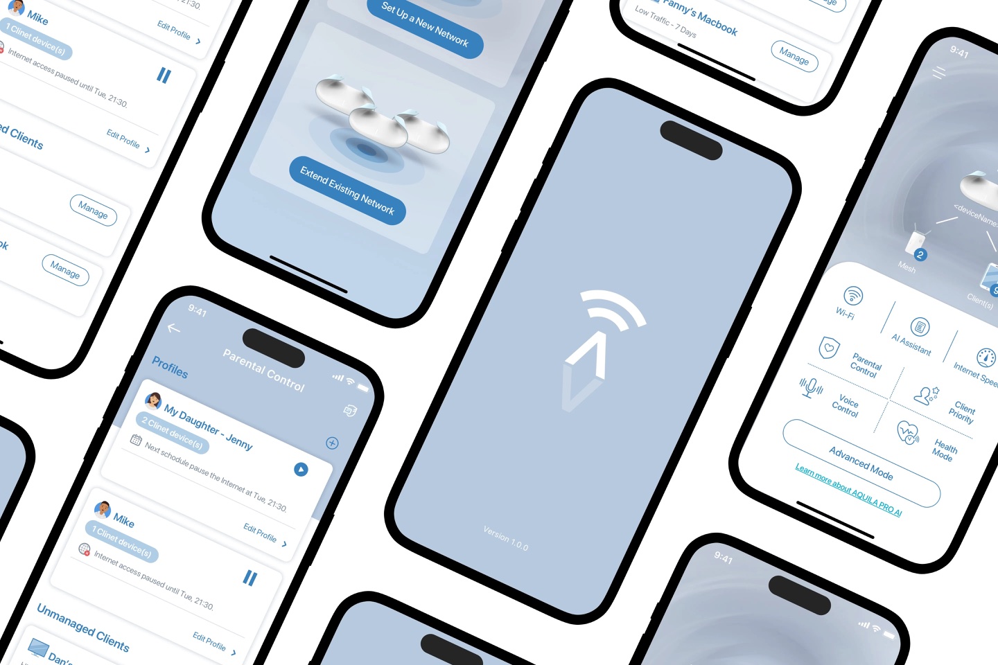
We proposed A and B. C shipped.
One proposal was conservative, the other rewrote the flow. Neither was picked. Seeing both ends helped the decision-makers point to the direction they wanted, and that became C.
Highlight #1
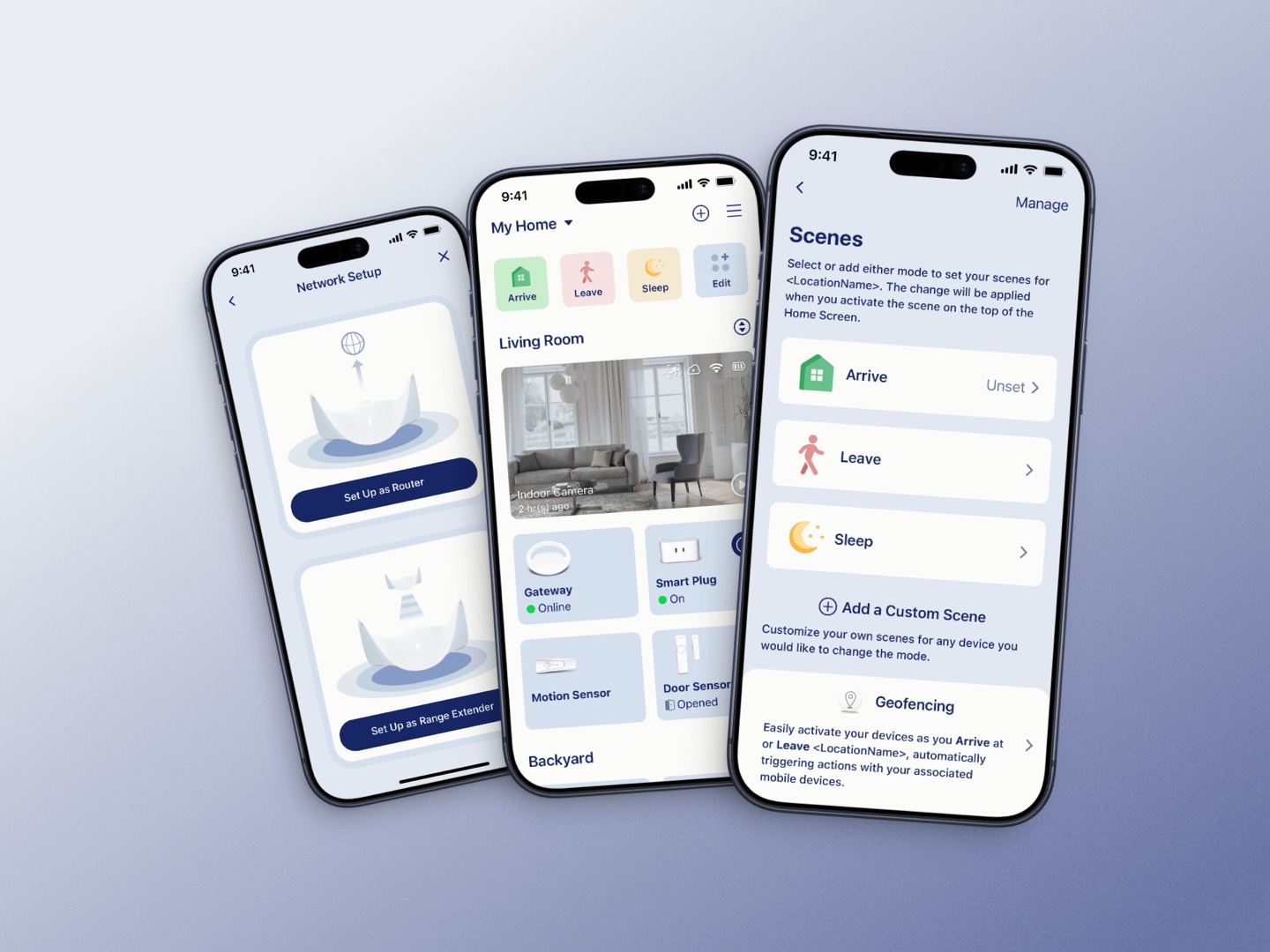
Setup: fewer words, more pictures
Problem. Nobody read the instructions. Nobody could find the Setup Code printed on the device. People who switched to the device's Wi-Fi often couldn't find their way back.
What changed. People choose their setup path on the first screen instead of halfway through. Every step has an illustration showing where the button or code is on the device. The Wi-Fi switch happens inside the app, with progress and an expected wait time.
Highlight #2
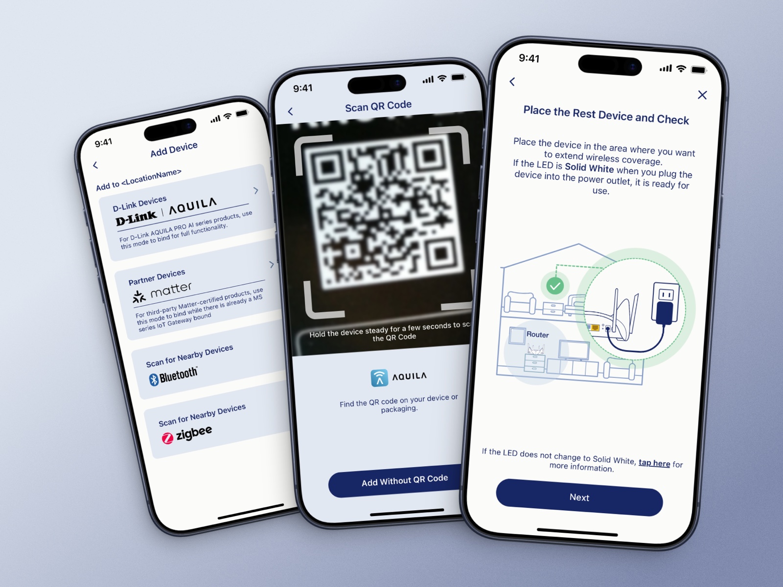
Tab Bar: the top three tasks, one tap away
Problem. Switching devices, checking live video and changing alerts were the most common tasks, all buried three levels deep. "I can't find it" kept showing up in support tickets.
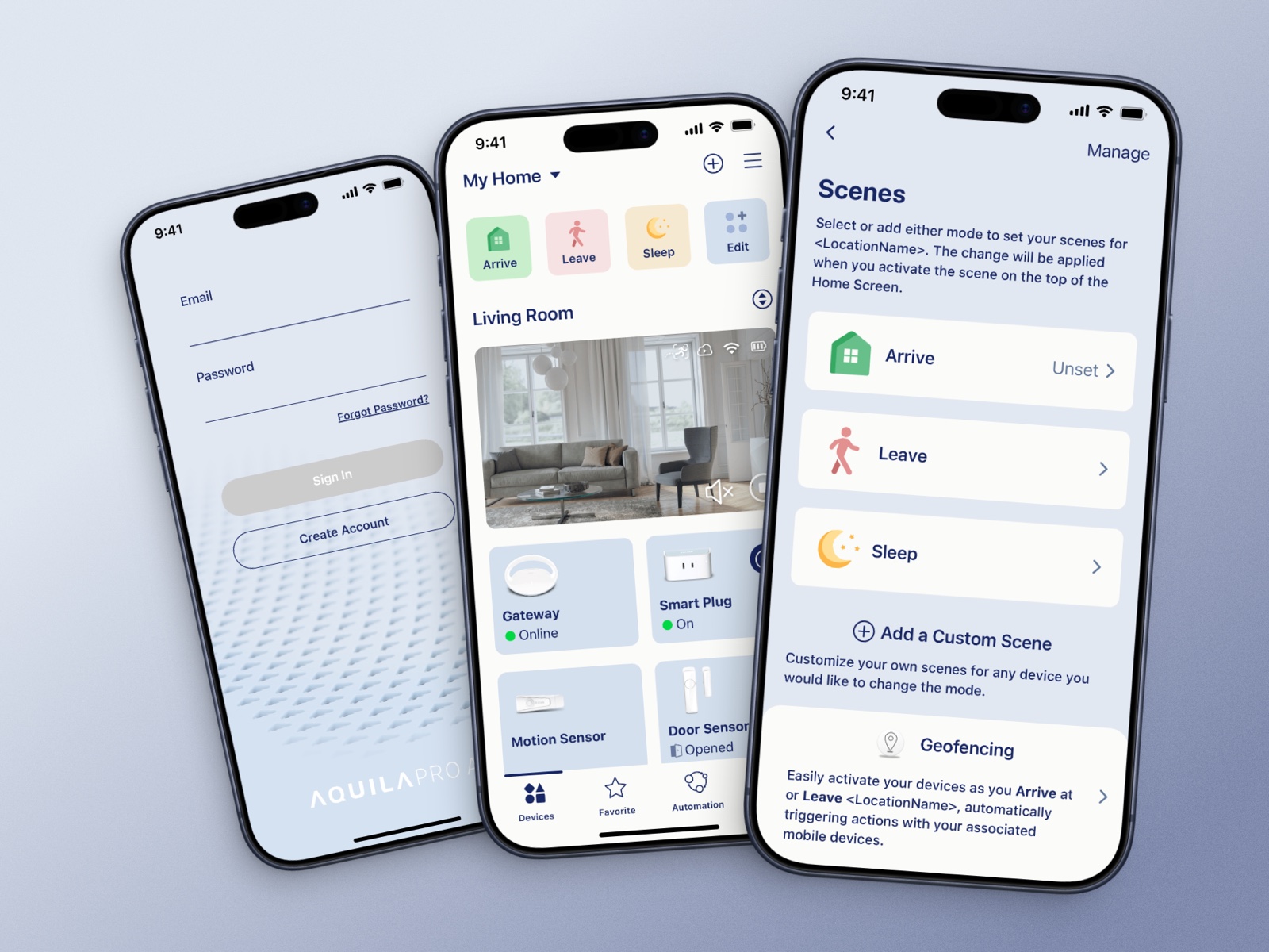
What changed. I restructured the Tab Bar to bring all three to the first level, with the same navigation on iOS, Android and web. The structure later became the navigation standard in the company design system.
- 3 → 1
- levels to the top tasks
- ~70%
- fewer related errors (estimated from support tickets)
Highlight #3
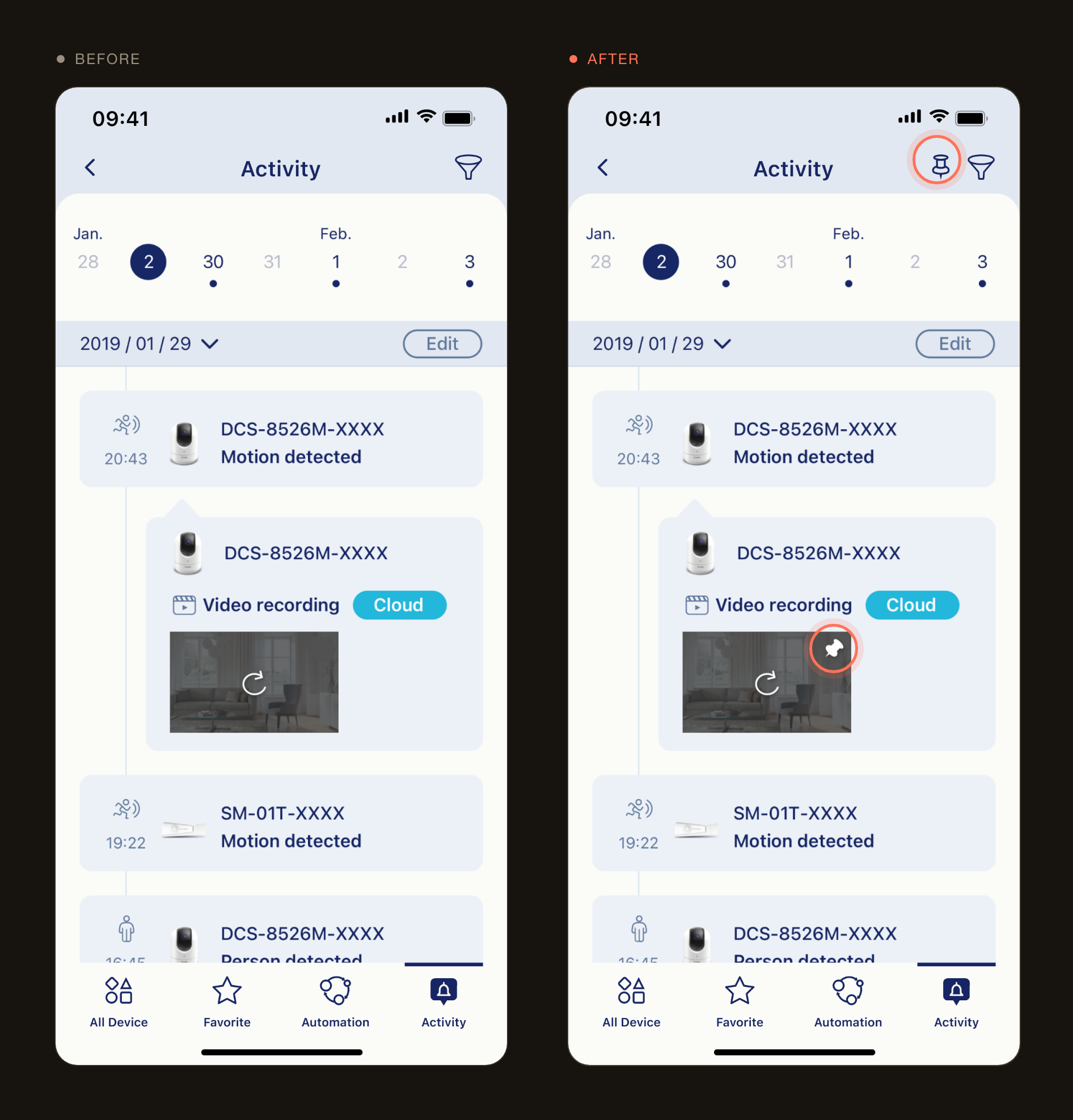
Activity: keep the place, fix what's inside
Problem. Recordings showed people opening Activity and leaving within two seconds. They could find it. There just wasn't anything worth staying for.
What changed. I didn't move it or add a red dot, because both would only bring more people to an empty page. Now each event opens the video clip from the moment it happened, and you can pin the events that matter so they don't get pushed down the timeline.
Highlight #4
Making the AI visible
Problem. The better automatic optimisation works, the less anyone notices it's doing anything.
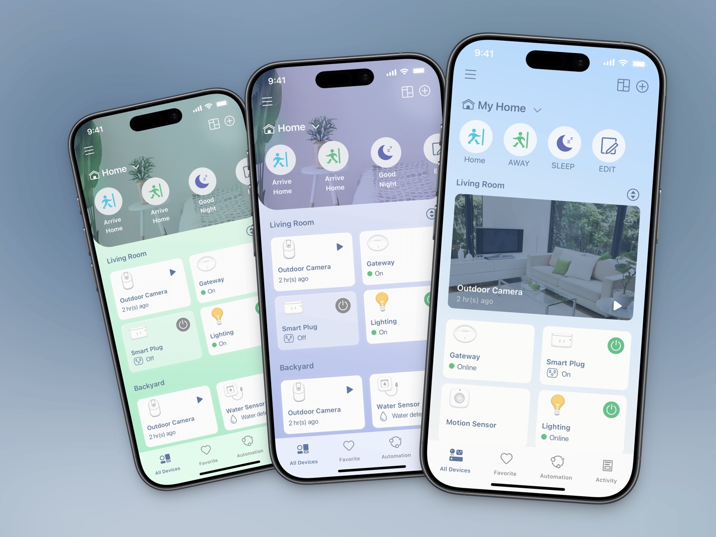
What changed. The app saves a weekly report and tells you what it did that week. Scenes come with presets (Arrive, Leave, Sleep) or you can build your own, with a small animation on each tap so you know it worked.
- Arrive
- Leave
- Sleep
- New scene
- Pet
- Vacation
Highlight #5
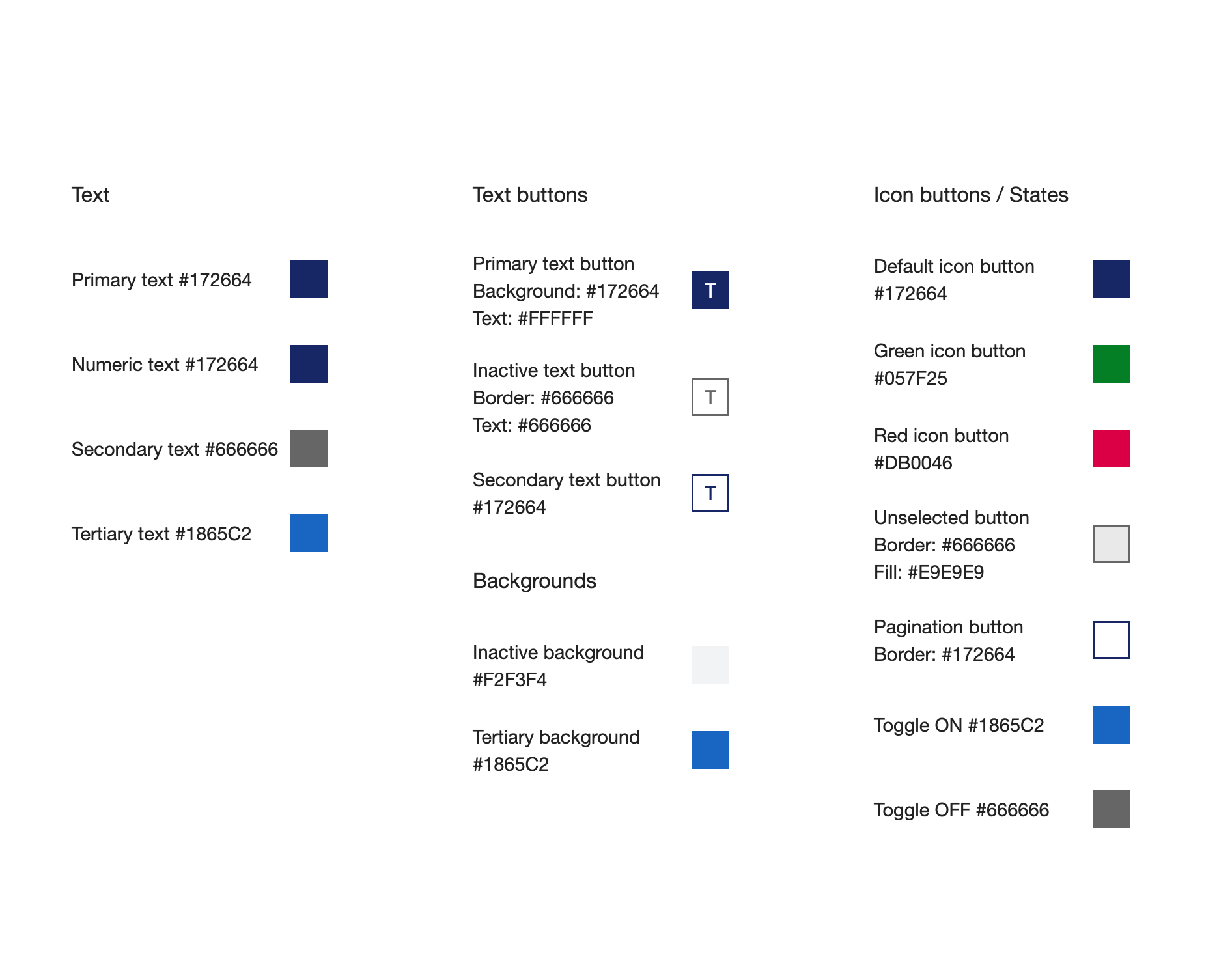
A colour system that passes by default
Every colour in the palette was contrast-checked first, and screens can only use colours from it. Every status uses colour, an icon and text together. Specs go down to the point, and I wrote the micro-animation code myself.
- AA
- WCAG, all colours
- AAA
- WCAG, primary text
Looking back
Three things I'd do differently
- 1
Measure before the redesign. Without a baseline I can't prove setup got better.
- 2
Add a few people who do know networking, to see which problems everyone has.
- 3
Agree on the criteria with the decision-makers before proposing.